Early Modern: New Typography
I created this piece to look like the futura spread by Renner. The original futura font is what attracted me to the piece originally. It also belongs to Early Modern New Typography. I loved the lowercase r that has the little circle next to it that makes it clear that its an "r".
Saturday, November 27, 2010
American Kitsch
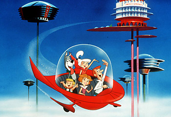
The Jetsons, a famous cartoon in the 60's, was very popular even when I was a kid. It reminded me of American Kitsch because of its futuristic atmosphere and extreme geometry. I found this online along with the other picture below. I was most attracted to the piece because of the familiar faces. The kidney shape even makes and appearance on the spaceship.
Late Modern
I created this in class. It replicates an old style of creating graphic design and an old design as well. Thompson did an amazing job on his original "Rock Roll" spread; which is what attracted me to this piece. The three colors, the printer colors cyan, magenta, and yellow, all show up on his design and would after mine was printed. It relates to Late Modern: New York School.
Swiss/International
I found Muller-Brockmann's "der Film" Poster in our book and liked it. So I decided to create an English version of it. The sans-serif type with "the" in gray and in the background; which gives more impact to the white foreground lettering "Film". This piece is part of the Swiss/International movement.
Contemporary
For this movement, Contemporary, I choose Milton Glaser's Bob Dylan Poster. I found a picture online that imitates the poster exactly except its Barbie. I found this quite funny that someone would create a picture of barbie with the same style. Of course, it has its own barbie style to it a little but overall it's very clever and contemporary.
Psychedelic
The psychedelic movement is clearly in use here with it curvy text and cloth banners. I found this by looking up the Grateful Dead online and found some of their old posters. I like this because of its simple color scheme and attractive art.
Postmodern
I was looking through the book and found this logo. I thought it looked clean and clear, so I decided to create my own version with Photoshop. This piece belongs to the Postmodern movement.
Digital
I found this example online. It has the exact technique of photo light exposure. I have always been interested in the light exposure images. I think there was an AT&T commercial that had the same technique, but I couldn't find it. This technique is definitely in the digital movement.
Wednesday, November 24, 2010
Hatch Show Print
Morgan and I visited Hatch Show Print today. The place is huge. There are walls and walls of shelves of old wood blocks. I was very interested in the overprints that made the image up. Its like using a mistake to make it better.
Monday, November 22, 2010
Paste-up or Ancient Graphic Design
Although not ancient, paste-up was used before the computer came into play. In class, we created a paste-up imitation of Bradbury Thompson's Westvaco Inspirations (the "Rock Roll" pages). First I created the page with all the stuff I wanted yellow. Then on top of that, I created the page I wanted to be cyan and above that the page I wanted to be magenta on transparent paper. After that I created a page with the circle of text and final letter that I wanted to be black; again on transparent paper. Finally, I placed a piece of tissue paper above all that and wrote which colors belong to where and how dark I wanted them printed. Overall I thought this was quite tedious and if this is what it still required to be a graphic designer; I wouldn't be in this field.
Mountain Dew Design
While searching through ad designs, I found this Mtn Dew ad. I love the contrast in the black, white, and lime green colors. The neon sign typography is also eye-catching. The complex, yet attractive, image in the foreground and background help draw your attention to the ad. The Mtn Dew logo is very faint but after looking at the image for more than a few moments; your attention is drawn to it and your brain deciphers it as their logo.
Monday, November 15, 2010
Rare Prints Gallery
Our class visited Rare Prints Gallery off the square in Franklin. We were informed, by a very nice lady our guide, about the types of prints in the store and how they were made. They had some very impressive prints. Some that I thought could never have been printed with a medal plate. Overall the prints were quite expensive but very stunning. My favorite print is the one directly below; it has so much beauty. I probably wouldn't visit again because of the ridiculous prices.
Black Ops arrives!
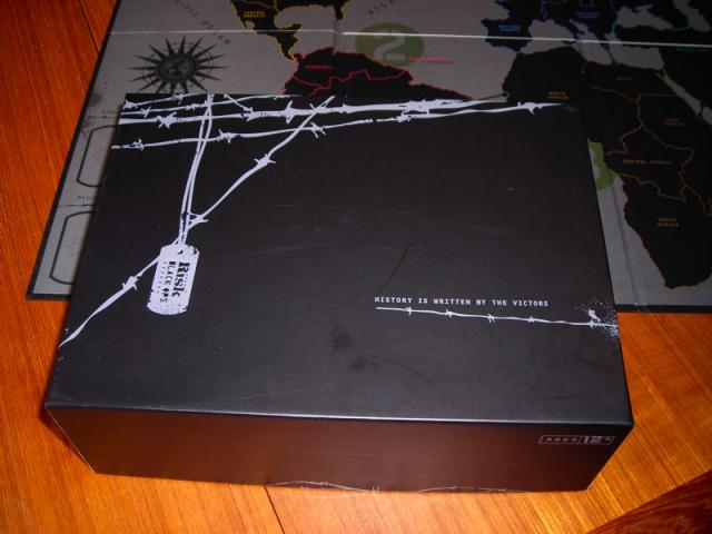
Call of Duty: Black Ops is one of the most anticipated games of the year. I pulled the image above from the internet and the image below I found while searching as well. It launched November 9th, although its the most anticipated game of the year, I don't like the image used for most of the advertisements and game package. The image above consists of one image and type with a grunge look. The package below is a package design from the same creators of Black Ops but its the board game Risk. I liked the package design more than the graphic above because of its simplicity and willingness to experiment. Although the graphic above is simple, I like the use of type centered on the image and the date being a different color gives it some contrast. The grunge effect adds to the hostile feel of the game.
Monday, November 8, 2010
Printmaking!!
In class today, we made a stamp and printed it to paper. First, you draw what you want to print on tracing paper. Then, flip the tracing paper, so the print comes out right, and apply the pattern onto the rubber. Carve everything outside the pattern and it'll be ready for printing. Finally, you just apply ink to your roller then your carved stamp. And print your design to paper. Overall I really enjoyed carving the rubber stamp and printing it out. Although I would have loved to be able to print with more colors.
PSP Billboard Design
I found these while searching for billboard examples on the web. These PSP billboard ads use creative placement and add a small graphic to make it seem like a game. The simplicity with only the letters "PSP" in the center make it even more impacting. The billboards background uses the background of where it's placed making it blend in a little, but making it more interesting because it makes the games seem more realistic than it is.
Monday, November 1, 2010
Type Factory Print Design
I found this piece on the internet looking at print designs. I thought this one was most interesting because of the use of only type to manipulate and form the idea. The use of cut up type reveals the hidden idea of type facts. This reminds me of the original Bauhaus in Europe with the experimentation of type only. I like the use of the short front page revealing the rest of the logo on the page behind it.
Subscribe to:
Posts (Atom)


