Early Modern: New Typography
I created this piece to look like the futura spread by Renner. The original futura font is what attracted me to the piece originally. It also belongs to Early Modern New Typography. I loved the lowercase r that has the little circle next to it that makes it clear that its an "r".
Cean - History of Graphic Design
Saturday, November 27, 2010
American Kitsch
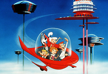
The Jetsons, a famous cartoon in the 60's, was very popular even when I was a kid. It reminded me of American Kitsch because of its futuristic atmosphere and extreme geometry. I found this online along with the other picture below. I was most attracted to the piece because of the familiar faces. The kidney shape even makes and appearance on the spaceship.
Late Modern
I created this in class. It replicates an old style of creating graphic design and an old design as well. Thompson did an amazing job on his original "Rock Roll" spread; which is what attracted me to this piece. The three colors, the printer colors cyan, magenta, and yellow, all show up on his design and would after mine was printed. It relates to Late Modern: New York School.
Swiss/International
I found Muller-Brockmann's "der Film" Poster in our book and liked it. So I decided to create an English version of it. The sans-serif type with "the" in gray and in the background; which gives more impact to the white foreground lettering "Film". This piece is part of the Swiss/International movement.
Contemporary
For this movement, Contemporary, I choose Milton Glaser's Bob Dylan Poster. I found a picture online that imitates the poster exactly except its Barbie. I found this quite funny that someone would create a picture of barbie with the same style. Of course, it has its own barbie style to it a little but overall it's very clever and contemporary.
Psychedelic
The psychedelic movement is clearly in use here with it curvy text and cloth banners. I found this by looking up the Grateful Dead online and found some of their old posters. I like this because of its simple color scheme and attractive art.
Postmodern
I was looking through the book and found this logo. I thought it looked clean and clear, so I decided to create my own version with Photoshop. This piece belongs to the Postmodern movement.
Subscribe to:
Posts (Atom)


